EcoKids
Date
June 2024
children's preloved clothing marketplace
Role
UX Design, UX Research, UI Design

In today's sustainable and budget-conscious world, many parents are looking for ways to provide quality clothing for their children without the high costs and environmental impact of fast fashion. Drawing from my appreciation for style and sustainability, I wanted to create an experience for buying and selling preloved children's clothing that feels as trustworthy and enjoyable as shopping at well-established brands like Carter's or Gap Kids. This project is about supporting parents in making eco-friendly and economical choices for their families while ensuring they don't have to compromise on quality or style.
The problem
Children outgrow clothing quickly and it can get expensive to constantly buy new clothes for them. This also results in accumulation of barely used clothing which can create clutter.
The goal
To allow parents to buy and resell children’s preloved clothing online, saving them time and money.


UNDERSTANDING THE USER
User research: summary
I conducted user interviews, which I then turned into empathy maps to better understand the target users and their needs. To gather authentic insights, I sought out people in my friends and family group who are parents and interviewed them. I discovered that a majority of these parents find shopping trips with their kids to be stressful and prefer online shopping. However, they noted that there are not a lot of reliable options to buy preloved clothing for kids online.


User research: pain points
Rapid growth of children
Children outgrow clothes quickly, leading to a constant need for new clothing and an abundance of barely worn outgrown clothes
High Cost of Children's Clothing
Buying new clothes frequently can be financially straining, especially for families on a budget
Environmental Concerns
Parents seek sustainable alternatives to buying new clothes for children and are looking for ways to reduce their carbon footprint
Busy schedules
Parents often have limited time to shop for new clothes or sell old ones, and traditional methods (like garage sales or thrift stores) can be time-consuming
Persona
Based on the background research and empathy maps, I created a user persona to represent potential users of the app. This persona includes details about their lifestyles, frustrations, and experiences. This deeper understanding of my target users then guided my design decisions to better meet their needs.

Problem statement:
Natalie Scott is a busy working mom who needs an easy way to buy and resell her children’s clothes because she is environmentally conscious and also wants to save time and money.
User journey maps
I created a user journey map to illustrate how the persona behaves, feels, and thinks while accomplishing their goals. This process helped identify further pain points and opportunities for improvement.

Competitive analysis
Having gained a clear understanding of my audience and their preferences, I proceeded to the next phase of my research: identifying companies that shared my goals and were frequently used by my audience. My competitive analysis focused on how these apps handled three key areas: interaction, visual design, and content.

Through the competitive analysis, I was able to identify market gaps and understand user expectations to inform feature development. I discovered that Kidizen excels in mobile experience, offering a vibrant, community-oriented platform with strong buying and selling features, though its accessibility could be improved. Young Loved provides a simple and functional user experience but lacks polish and advanced features. Carter’s, as a well-established brand, offers a polished, seamless retail experience with strong accessibility and navigation, but it focuses more on e-commerce than community interaction or resale. Each platform has its strengths, with Kidizen being community-driven, Young Loved budget-friendly, and Carter’s highly professional and trusted.
STARTING THE DESIGN
User flow
I started off the design process by mapping out the main user flows:
1. Buy a preloved children's clothing item

1. Post a listing to sell a clothing item

Paper wireframes
Based on the core features discovered in the user research and the different screens identified in the user flow diagrams, I began sketching paper wireframes and producing several versions to compare and refine, keeping the user pain points about navigation, browsing, and checkout flow in mind.
Homepage Screen


Create a Listing Screen


Shop Screen


Other Screens

Digital wireframes
After refining my paper wireframes, I converted them into digital wireframes. Keeping the navigation simple and easy and personalizing the user experience for the user was a key part of my strategy.

Homepage Screen

Browse and Shop Screens
Low-fidelity prototype
Using the user flow diagram and wireframes, I developed a low-fidelity prototype to test functionality and ensure accessibility before integrating it into the final design.
Usability study: parameters
Study Type:
Unmoderated usability study
Location:
United States, remote
Participants:
4 participants
Length:
15-20 minutes
A usability study was conducted to test out the main user flows and get feedback on the navigation and layout. The main findings uncovered were that:
1
Homepage
Users thought that the homepage was too overwhelming and cluttered with content
2
Browse
Users want more subcategories to choose from while searching, for more specified browsing
3
Checkout
During the checkout process, the order summary or total amount due was not visible which made it confusing
REFINING THE DESIGN
Modifications
Based on the findings and insights from the usability studies, I made modifications and applied design changes to the mockups to improve the user experience.
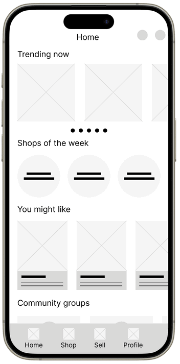
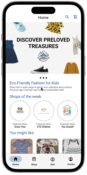
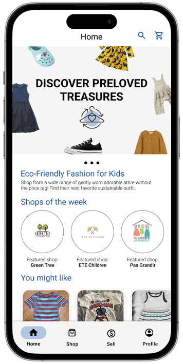
I simplified the homepage by removing ‘Trending now’ and ‘Nearby Items’. Instead I added a carousel at the top with information about the brand and its identity.

To improve the browsing experience and for more specified browsing, I added more subcategories and filters to choose from while searching for listings.

To remove confusion during the checkout process, I added an Order Summary display so users know the total amount that is due before confirming the order and checking out.

FINAL TAKEAWAYS
Impact
According to target users, the app successfully provides a user-friendly platform for parents to access affordable, high-quality preloved children’s clothing, promoting both economic savings and environmental sustainability while building a supportive community.
Learnings
The development journey has been an enlightening experience, emphasizing the importance of understanding user behavior, simplifying interactions, balancing information, building trust, and promoting sustainability to create a successful and engaging app.