Invoice Pro
Date
April - May 2024
digital invoicing tool
Role
UX Design, UX Research, UI Design

In today's fast-paced digital world, small business owners need efficient and reliable tools to manage their operations. As someone who has owned and run a small business, I understand firsthand the challenges of juggling multiple responsibilities, including the often time-consuming task of invoicing. The primary goal of this project was to draw from these personal insights, understand the pain points of fellow small business owners, and create a solution that simplifies the invoicing process.
The problem
Manually creating an invoice, sending it to clients and then keeping track of its payment status can be a time consuming and frustrating task for small business owners
The goal
To allow small business owners to create, send and track invoices quickly and with ease

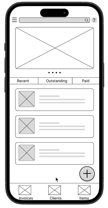
Homepage
Hamburger menu
Help & Support
Create invoice
UNDERSTANDING THE USER
User research: summary
To understand user frustration, needs, and requirements, I conducted secondary research by going through groups for Small Business Owners on facebook and reddit to find out the challenges they face regarding invoicing and payments for their services. My goal was to gain insights to understand the processes users go through on their daily business operations.
User research: pain points
Time Consuming Process
Creating invoices manually can be labor intensive and time consuming
Delayed payments
Following up on unpaid invoices can also take up time and be an uncomfortable task, often resulting in delayed payments
Errors and Discrepancies
Lack of automation and manually creating invoices can increase chances of errors and discrepancies
Record keeping and Reporting
Keeping track of all invoices and payments can become overwhelming, specially with a growing client base
Personas
From the background research, I made two user personas to represent users who may find this application useful and provided context about their about their lifestyles, frustrations, and experiences. This helped me understand my target users better and guide design decisions that would meet their needs.

Problem statement:
Karen Yeong is an overworked home based cake business owner who needs a faster way to send and track invoices because doing it manually takes up too much of her time and keeps her away from family.

Problem statement:
Paul Jefferson is a busy high school teacher and online tutor who needs a faster way to track invoices and client records because doing it manually takes up too much of his time.
User journey maps
By creating user journey maps, I wanted to illustrate the process of how the personas behave, feel, and what they think while accomplishing their goals in order to address pain points and come up with improvement opportunities.


Competitive analysis
With a clear understanding of my audience and their preferences, I advanced to the next phase of my research - identifying companies that shared my goals and those frequently used by my audience. In my competitive analysis, I focused on how these apps approached three specific areas: Interaction, Visual design and Content.

The competitive analysis allowed me to set benchmarks for design quality, performance, and user experience as well as learn from competitors’ weaknesses to avoid similar issues in my app. I discovered that Invoice Simple excels in simplicity and quick invoicing with straightforward navigation but lacks advanced accessibility features and may be too basic for some users. Bookipi offers a comprehensive financial tool with modern design and intuitive navigation but can overwhelm with its extensive features and needs work on its accessibility as well. Sortly, even though not a direct competitor, is well-suited for complex inventory management with detailed, structured navigation and a strong brand identity but may be cumbersome for simpler needs and could also improve in accessibility.
STARTING THE DESIGN
User flow
I started off the design process by mapping out the main user flows - sending and tracking invoices. I made sure that the flows were used-focused so that my personas can successfully complete their key objectives while reducing their existing pain points.

Paper wireframes
Focusing on the core features identified during the user research, I moved on to sketching out paper wireframes for different screens and came up with multiple versions to compare and refine.


Digital wireframes
After refining my paper wireframes, I converted them into digital wireframes based on user needs, goals, and pain points uncovered during research.

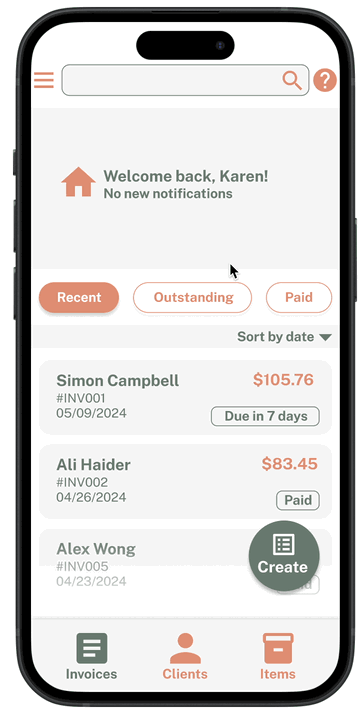
Homepage

Create an invoice
Low-fidelity prototype
I created a low-fidelity prototype from the user flow diagram and wireframes to test functionality before incorporating it into the final design and ensure accessibility for end-users.
Usability study: parameters
Study Type:
Unmoderated usability study
Location:
United States, remote
Participants:
5 participants
Length:
15-20 minutes
The first usability study was done with the lo-fi prototype to find out the most common usability issues with the app and the second usability study was done with the hi-fi prototype for further refinement and to test out any issues with the UI.
Synthesize results: Affinity diagram

Round 1 Findings
01
Creating a new invoice was not immediately clear for most users
02
Filling out the form is confusing for most users
03
Not everyone can easily locate Help and Support
Round 2 Findings
01
Color palette lacks contrast so buttons don’t stand out as much
02
The typeface is not very legible for some users and lacks hierarchy
03
All invoice cards should have tags marking status of payment of invoice
REFINING THE DESIGN
Modifications
Based on insights from the usability studies, I made modifications and applied design changes to the mockups to improve the user experience.
I made a more well-defined sign for invoice creation to avoid confusion and also made the Help and Support symbol bigger in size so it is easier to find.

I removed the buttons from the form fields to make the design intuitive and switched the placement of the Save and Send buttons.

I adjusted the color palette to create more contrast so that buttons stand out more and I also changed the typeface to a more legible one and added hierarchy to it.

I added tags marking payment statuses to all Invoice cards for better tracking.

Accessibility considerations
The color palette of the app has high visual contrast so that it is easy to read. White and light grey are used as background colours so that the orange and dark green accent colors are emphasised.
1
Wherever there is use of icons in the app, it is accompanied with labels as well so that a screen reader is able to read them.
2
Change in color has not been used as the only indicator of change in state while selecting mode of delivery.
3
FINAL TAKEAWAYS
Impact
Our target users shared that the design was intuitive and easy to navigate because it was simple and there was no clutter.
Learnings
I have gained valuable insights and knowledge through the design process. Some of the key things I have learned include:
-
Understanding user needs
-
Accessibility considerations
-
Understanding and implementing user feedback
-
Manage information to not overwhelm the user